Behind the Design: Docusign
The brand and creative team at Docusign launched a new brand and visual identity for Docusign. As Associate Creative Director, I helped provide creative direction for new visual systems and built guidelines around photography and motion. Here are some behind the scenes of developing the visual language of the new brand and the team process for the strategy.
What We Did
Design Direction
Visual Design
Motion
Branding
How We Work
Our brand and creative team is remote, spread throughout the US and Canada but during the Docusign Rebrand we gathered for in-person, visual sprints, research, design planning, and launch day.
Brand Promise
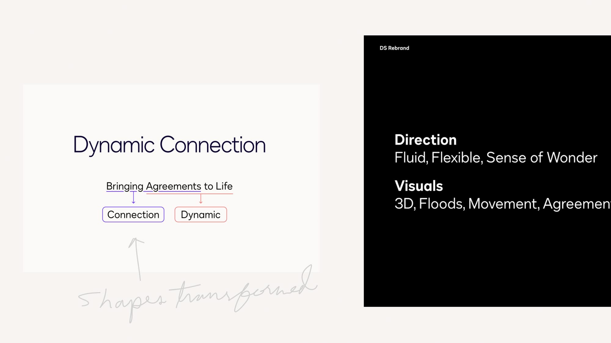
Our new brand is focused around the brand promise of 'Bringing Agreements to Life'. As a team, we had landed on a final logo mark and brand strategy framework, but now we needed to explore how this big idea would be expressed visually and within our different applications.
Visual Language
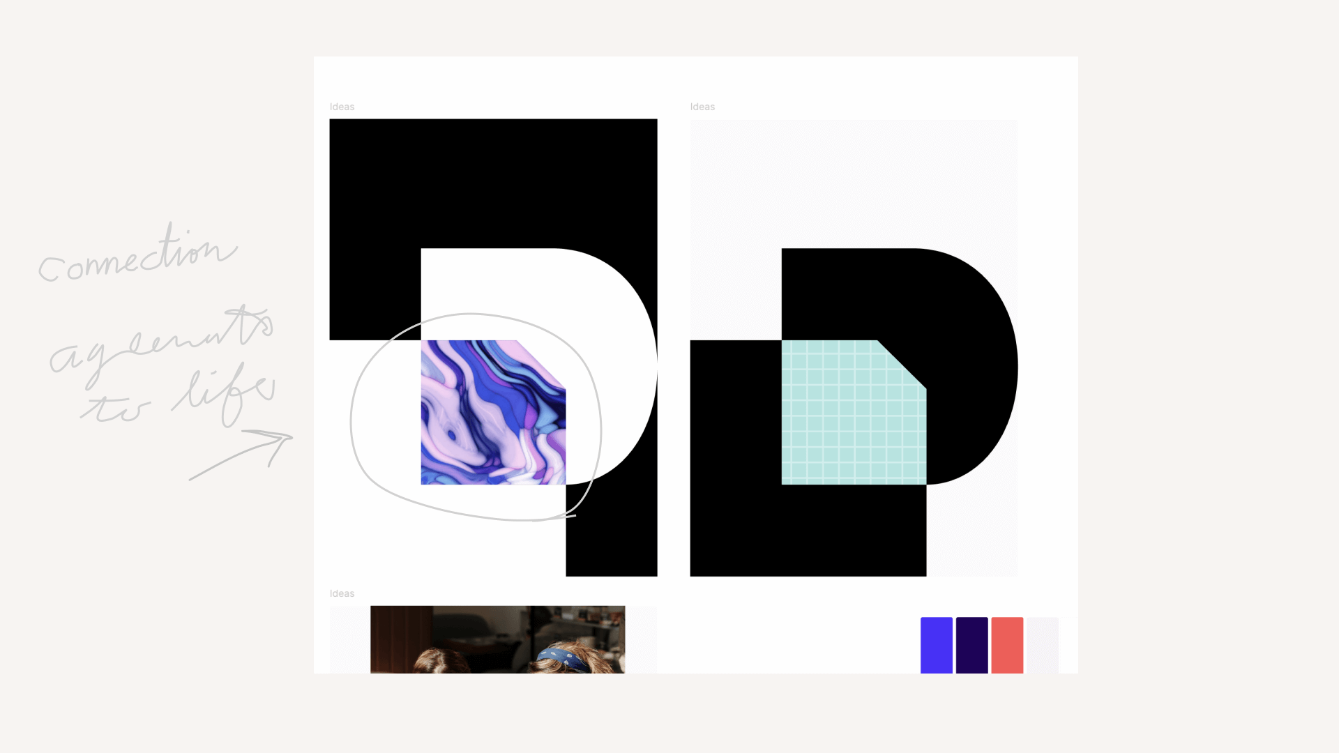
We started to experiment with how 'agreements to life' could look visually. Using the new Docusign mark as a container, we placed new materials, textures and patterns into the document shape. The static form of the new logo began to feel alive and our strategy was now connected — transforming static documents into a living, breathing agreement.
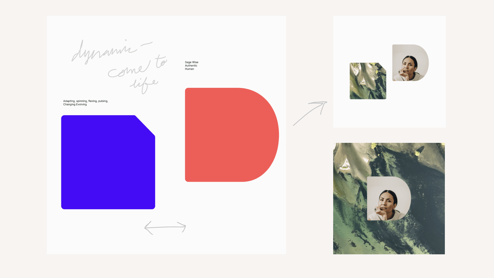
Dynamic Connection
We started bringing in more contextual photography and bold, customer portraits with what we called a Dynamic Connection. These visuals showed how Docusign brings parties together but also gathers agreements into one, easily accessible platform.
More on the Docusign Brand
If you want to see more of the visual system in use, check out the interactive Brand Guidelines: https://brand.docusign.com/


